DIVI Update: What’s new in 2.6
Responsive Editing
The DIVI theme is fully responsive, which means it fits any screen it is displayed on. However, if you wish to adjust interface items one at a time for every device feel free to do so with DIVI 2.6!
Customizable Content Blocks
DIVI 2.6 allows you to display content blocks according to the device. You want a field to appear solely on mobile? No worries. Thanks to the update, a “Disable” item will show up in the “Options menu and you will be able to choose which block should be displayed on PC or mobile.
Slide-In Menu
In this new update, you have the ability to select a type of menu called “Slide-In”. Just left-click on the button and the menu will slide-in. Toggles are a great way to improve user experience.
Full Screen Header
In addition to the Slide-In menu, DIVI 2.6 includes a full screen menu. Simply click on the menu button and the navigation will occupy all the available space in the header.
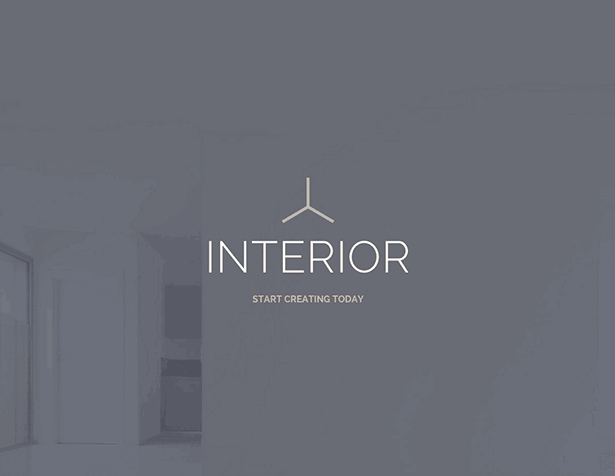
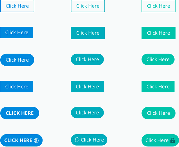
Customize you user interface
One missing key feature from the previous update was to offer a completely customizable interface. Now, on DIVI 2.6 you can adjust every call-to-action on your website.
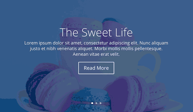
Post slider Module
This module makes it easy to add articles and posts them to the top of your page in a slider format. There is no need to keep doing this manually any longer. Everything is taken care of by the module.
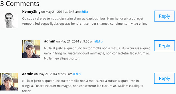
Comments Module
DIVI 2.6 allows you to handle the comment section like never before. You are no longer restricted to place your comment section on the bottom of your page
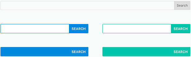
The Search Module
With DIVI 2.6 comes a truly outstanding feature: universal search. You are not limited with the classic search widget in the sidebar. Now, you can add a search section from anywhere on your website.
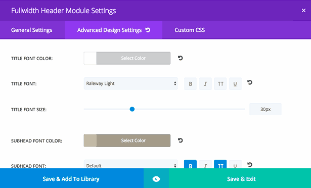
On top of that you can customize your search bar anyway you want thanks to the new design settings. Make it your own!